□ 타이타닉 데이터를 전처리 후 시각화
○ 승객 나이대별 히스토그램 시각화
○ 남녀 승객수를 막대그래프 시각화
○ 객실별 사망자수 시각화
○ 사망자와 생존자 비율 pie 그래프 시각화
□ 데이터 불러오기 및 조회
#라이브러리 호출
import matplotlib.pyplot as plt
import seaborn as sns
import pandas as pd
from matplotlib import font_manager, rc

#폰트지정 및 불러오기
plt.rcParams['axes.unicode_minus'] = False
f_path = 'C:/Windows/Fonts/malgun.ttf'
font_name = font_manager.FontProperties(fname=f_path).get_name()
rc('font',family = font_name)

titanic = sns.load_dataset('titanic')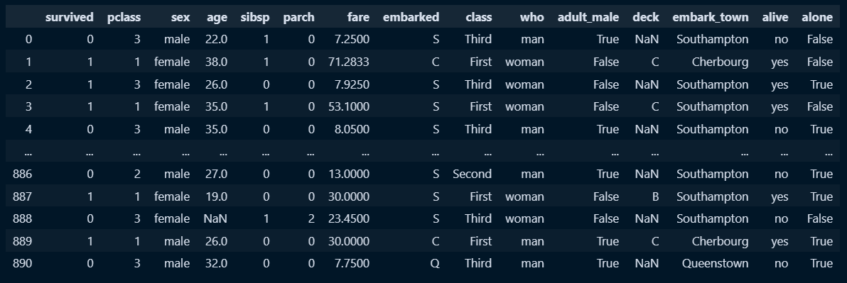
□ 사망여부 0, 1을 생존자, 사망자로 전처리
#데이터 전처리
a =pd.Series(titanic['survived'].values)
b = list()
#survived 필드 값을 반복문을 돌려 리스트에 담고, 해당 리스트를 survived 값으로 지정
for i in a:
    if i == 1:
        i = '생존자'
    else:
        i = '사망자'
    pd.Series(b.append(i))
titanic['survived'] = b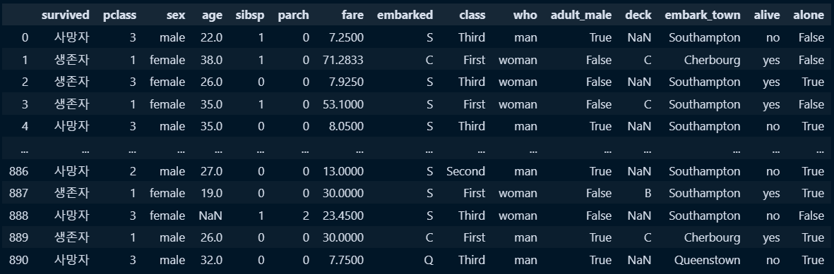
□ 승객 나이대별 히스토그램 시각화
#시각화 틀과, 시각화 그래프 객체 지정
count, ax =plt.subplots()
#histplot시각화 및 데이터 지정
sns.histplot(data=titanic, x='age', ax=ax)
#시각화 데이터 제목 지정
ax.set_title('Titanic Passenger age')
#x축 이름 지정
ax.set_xlabel('age')
#y축 이름 지정
ax.set_ylabel('Count')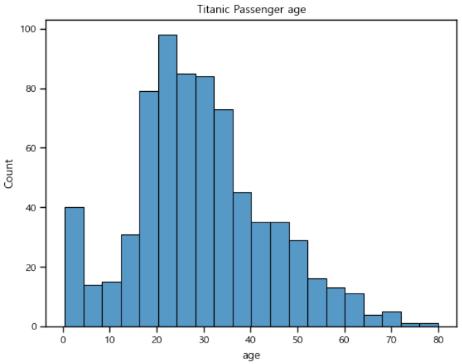
□ 남녀 승객수를 막대그래프 시각화
#시각화 틀과, 시각화 그래프 객체 지정
count, ax =plt.subplots()
#countplot시각화 및 데이터 지정
sns.countplot(data=titanic, x='sex', palette='viridis',ax=ax) #palette 막대그래프 색상
#시각화 데이터 제목 지정
ax.set_title('Passenger of Titanic by Gender')
#x축 이름 지정
ax.set_xlabel('Gender')
#y축 이름 지정
ax.set_ylabel('Count')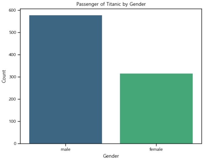
□ 객실별 사망자수 시각화
#시각화 틀과, 시각화 그래프 객체 지정
count, ax =plt.subplots()
#countplot시각화 및 데이터 지정
sns.countplot(data=titanic, x='class', palette='viridis',ax=ax) #palette 막대그래프 색상
#시각화 데이터 제목 지정
ax.set_title('Dead of Titanic by Class')
#x축 이름 지정
ax.set_xlabel('Class')
#y축 이름 지정
ax.set_ylabel('Count')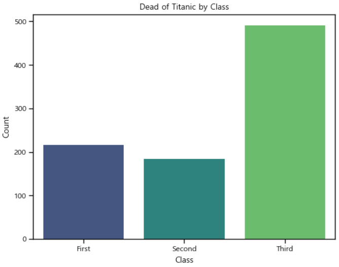
□ 사망자와 생존자 비율 pie 그래프 시각화
#집계함수를 사용해 생존자, 사망자 집계
survived_counts = titanic['survived'].value_counts()
#시각화 틀과, 시각화 그래프 객체 지정
fig, ax = plt.subplots()
# 파이 그래프 그리기
ax.pie(survived_counts, labels=survived_counts.index, autopct='%1.1f%%', startangle=90, colors=['red', 'green'])
#시각화 데이터 제목 지정
ax.set_title('타이타닉 사망자/생존자')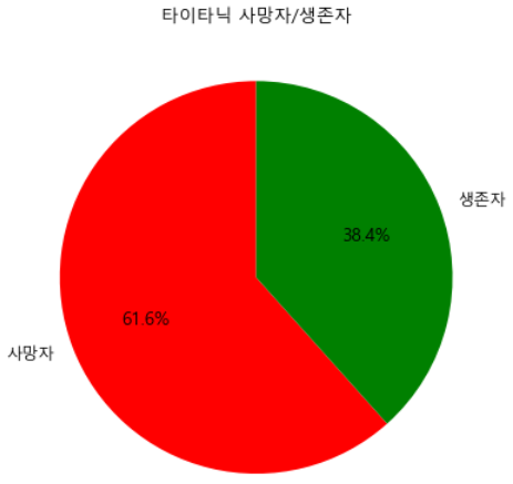
'Portfolio & Toy-Project' 카테고리의 다른 글
| 프로젝트 : 부산항만공사 서비스 제안관련 데이터분석-1 (0) | 2024.03.11 |
|---|---|
| 판다스 : .melt() 함수1 (0) | 2024.02.07 |
| 청소년 우울증(18년도, 22년도) : 연속 시각화(파이형그래프) 차트 생성 및 배치 (1) | 2024.02.07 |
| 임의 페이지 텍스트 크롤링 및 엑셀저장 (1) | 2024.01.30 |
| 파이썬(셀레니움)자동화_(구글 스프레드시트/카카오톡API&엑셀저장) (1) | 2024.01.25 |


